spotlight APL function, see spotlight.
Spotlight is particularly useful for:
- Root cause analysis: Quickly identify why certain traces are slower, errors are occurring, or performance is degraded.
- Anomaly investigation: Understand what makes problematic events different from normal baseline behavior.
- Pattern discovery: Spot trends and correlations in your data that might not be immediately obvious.
Axiom’s Spotlight feature in action
How Spotlight works
Spotlight compares two sets of events:- Comparison set: The events you select by highlighting a region on a chart.
- Baseline set: All other events that contributed to the chart.
- Calculates the differences between the two sets and ranks them by significance.
- Displays the most interesting differences using visualizations that adapt to your data types.
- Gives an AI-generated summary that helps you interpret the visualizations.
Use Spotlight
Start Spotlight analysis
- In the Query tab, create a query that produces a heatmap or time series chart.
- On the chart, click and drag to select the region you want to investigate.
- In the selection tooltip, click Run Spotlight.
Interpret results
Spotlight displays results using two types of visualization, depending on your data:-
Bar charts for categorical fields (strings, booleans)
- Compares the proportion of events that have a given value for selected and baseline events.
- Useful for understanding differences in status codes, service names, or boolean flags.
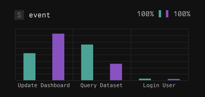
Example barchart
-
Boxplots for numeric fields (integers, floats, timespans) with many distinct values
- Shows the range of values in both comparison and baseline sets.
- Identifies the minimum, P25, P75, and maximum values.
- Useful for understanding differences in response times or other numeric quantities.
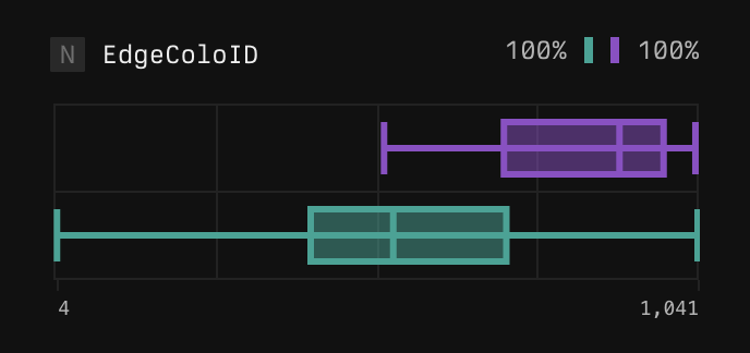
Example boxplot
Dig deeper
To dig deeper, iteratively refine your Spotlight analysis or jump to a view of matching events.- Filter and re-run: Right-click specific values in the results and select Re-run spotlight to filter your data and run Spotlight again with a more focused scope.
- Show events: Rick-click specific values in the results and select Show events to filter your data and see matching events.
Spotlight limitations
- Custom attributes: Currently, custom attributes in OTel spans aren’t included in the Spotlight results. Axiom will soon support custom attributes in Spotlight.
- Complex queries: Spotlight works well for queries with maximum one aggregation step. Complex queries with multiple aggregations aren’t supported.
Example workflows
Investigate slow traces
-
Create a heatmap of trace durations. For example, run the following query:
Run in Playground
- Select the region showing the slowest traces.
- Run Spotlight to see if slow traces are associated with specific endpoints, regions, or user segments.
Understand error spikes
-
Build a time series of error-level logs. For example, run the following query:
Run in Playground
- Select the time period where errors spiked.
- Run Spotlight to identify if there’s anything different about the selected errors.